;
};
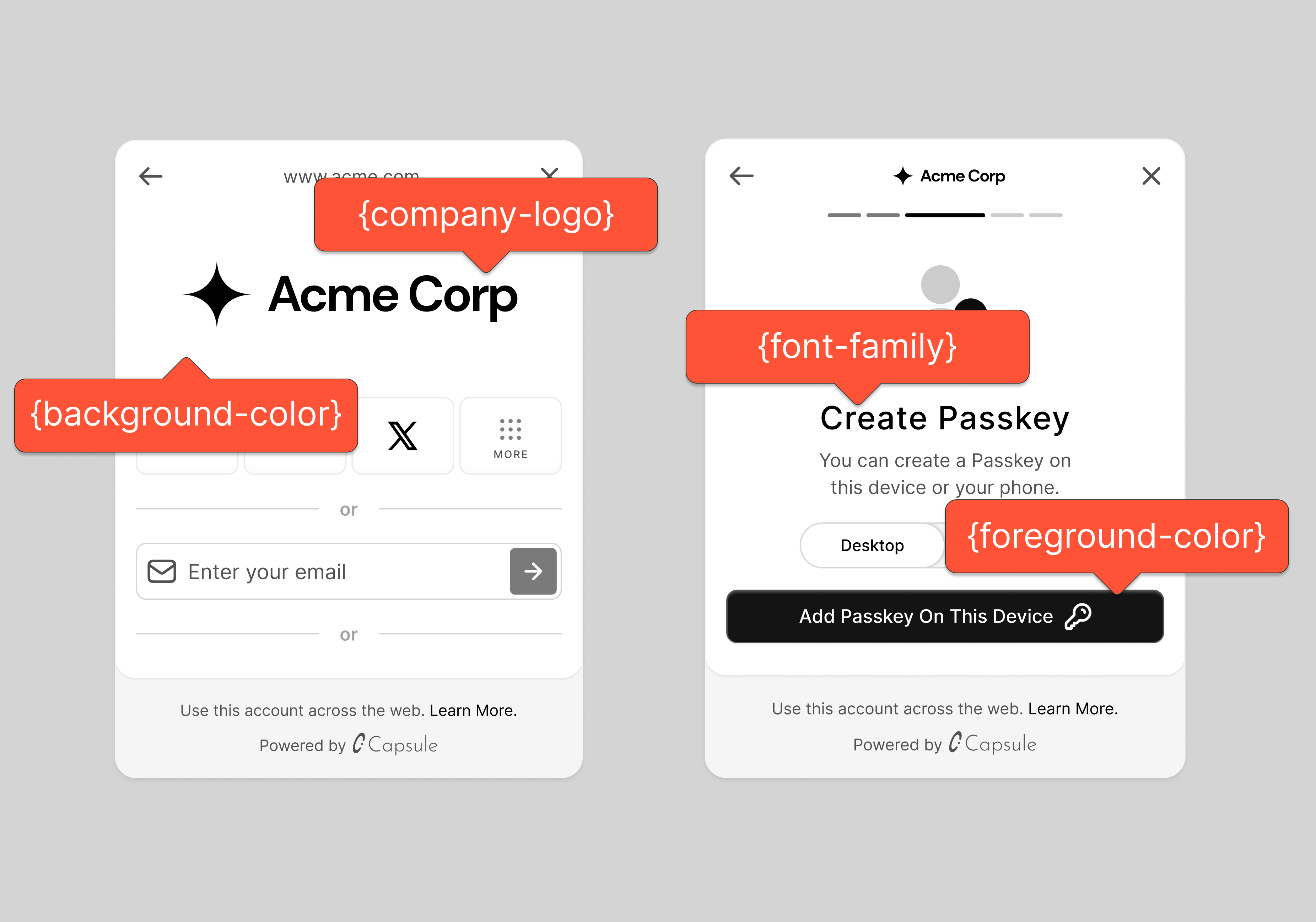
The Para Modal is designed to be easily customizable, allowing you to adapt its appearance to fit your application's
design. UI and theming options are props that can be passed to the `ParaModal` component. These props allow you to
configure the modal's appearance, authentication options, and security features.
## Modal Configuration
### Required Props
A few props are required to ensure the modal displays correctly. These include the `appName` and `logo` props, which are
essential for branding and user recognition.
```tsx theme={null}
```
For optimal display, use a logo image with dimensions of 372px X 160px.
I'll add a section about the `currentStepOverride` prop in the Modal Configuration section, after the Required Props
section. Here's how I would add it:
### Wallet Balance
This prop allow the passing of an RPC URL from which the balance will be fetched and displayed for the selected wallet.
Specify the RPL URL where the wallet balance should be fetched from.
```tsx theme={null}
```
Balance display is currently only available for EVM wallets.
### Step Override
The `currentStepOverride` prop allows you to control which step of the modal flow is displayed when the modal opens.
This is useful when you want to skip directly to a specific step rather than starting from the beginning of the flow.
Override the initial step shown in the modal. Accepts either uppercase or lowercase step names.
```tsx theme={null}
```
Available steps include:
* `AUTH_MAIN` - Main authentication options
* `AUTH_MORE` - Additional authentication methods
* `EX_WALLET_MORE` - External wallet options
* `EX_WALLET_SELECTED` - Selected external wallet
* `VERIFICATIONS` - Verification steps
* `BIOMETRIC_CREATION` - Biometric setup
* `PASSWORD_CREATION` - Password creation
* `SECRET` - Recovery secret display
* `ACCOUNT_MAIN` - Main account view
* `ADD_FUNDS_BUY` - Buy crypto view
* `ADD_FUNDS_RECEIVE` - Receive crypto view
* `CHAIN_SWITCH` - Chain selection view
And many more steps for specific flows like OAuth, 2FA setup, and funds management.
Setting an invalid step or a step that requires previous steps to be completed may cause unexpected behavior. Ensure
the step override makes sense in your authentication flow.
### Authentication Options
The authentication options allow you to control the authentication methods available to users. You can enable or disable
email and phone login, as well as specify the order of OAuth methods.
Specify OAuth methods to display. The order of methods in the array determines their display order in the modal.
Disable email login if set to true
Disable phone login if set to true
```tsx theme={null}
```
### Security Features
Configure additional security steps in the Para modal by setting `twoFactorAuthEnabled` and `recoverySecretStepEnabled`
flags. When enabled, these flags add their respective authentication steps to the modal's UI flow. Two-factor
authentication adds a verification code step, while the recovery secret step allows users to download and store their
account recovery credentials.
Enable two-factor authentication steps
Show wallet recovery option to users
```tsx theme={null}
```
### External Wallets
This prop allows you to specify which external wallets are supported for login. The order of wallets in the array
determines their display order in the modal.
Specify external wallets to support. The order of wallets in the array determines their display order.
```tsx theme={null}
```
For more details on external wallet integration in the Para modal, refer to the
### Auth Layout
The `authLayout` prop can expand or collapse the view of OAuth methods and external wallets. Only one of `Auth:` or
`External:` can be passed into the array, either `CONDENSED` or `FULL` UI versions of each. The order of the array
determines the order that the components will be displayed in the modal.
Configure the layout of auth components
```tsx theme={null}
```
Use our to visualize different layout configurations before implementing them in your project.
## Theming
You can customize the overall look of the Para modal by providing a theme object with the following properties all of
which are optional:
```typescript theme={null}
interface ParaTheme {
foregroundColor?: string; // Primary text and icon color
backgroundColor?: string; // Background color of the modal
accentColor?: string; // Color for interactive elements and highlights
darkForegroundColor?: string; // Foreground color for dark mode
darkBackgroundColor?: string; // Background color for dark mode
darkAccentColor?: string; // Accent color for dark mode
mode?: "light" | "dark"; // Set the overall theme mode
borderRadius?: BorderRadius; // Set the border radius for UI elements
font?: string; // Specify the font family to use
}
```
It's crucial to set the `mode` correctly based on your background color to ensure all components remain visible.
An example of a basic theme object is as follows:
```tsx theme={null}
```
You can use custom fonts by importing them in your global CSS and specifying the font face in the `font` variable of
the theme.
### Advanced Theme Customization
The para modal also offers more granular control over specific UI elements through the `customPalette` property. This
allows you to define colors for various components, ensuring that the modal aligns perfectly with your application's
design language.
```tsx theme={null}
```
By leveraging these theming options, you can ensure that the Para modal seamlessly integrates with your application's
design language, providing a cohesive user experience.
## Examples
To see what all of these props look like in practice, check out our live demo:
For an example code implementation of Para Modal with all the props mentioned in this guide, check out our GitHub
repository:
## Next Steps
Now that you have customized the Para modal to fit your application's design, you can explore other features and
integrations to enhance your Para experience. Here are some resources to help you get started:
### Ecosystems
Learn how to use Para with popular Web3 clients and wallet connectors. We'll cover integration with key libraries for
EVM, Solana, and Cosmos ecosystems.
 }
{(iconUrl || fontAwesomeIcon) &&
}
{(iconUrl || fontAwesomeIcon) &&
 }
}
 ## Modal Configuration
### Required Props
A few props are required to ensure the modal displays correctly. These include the `appName` and `logo` props, which are
essential for branding and user recognition.
```tsx theme={null}
## Modal Configuration
### Required Props
A few props are required to ensure the modal displays correctly. These include the `appName` and `logo` props, which are
essential for branding and user recognition.
```tsx theme={null}