;
};
export const Link = ({href, label, newTab = false}) => {
const [isHovered, setIsHovered] = useState(false);
return setIsHovered(true)} onMouseLeave={() => setIsHovered(false)}>
{label}
;
};
Customize the visual appearance of Welcome and OTP emails sent to your users during authentication. These branding settings apply specifically to automated emails, not your Para modal interface. If you're looking to customize the modal appearance, refer to the .
## Brand Colors
Configure your brand colors to match your company's visual identity in all email communications.
### Color Settings
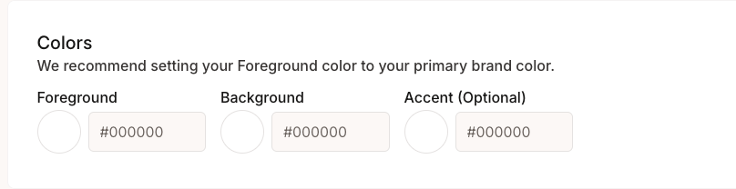
* **Foreground**: Primary brand color for buttons, links, and highlights
* **Background**: Background color for email content areas
* **Accent (Optional)**: Secondary color for borders and accents
- Use your primary brand color for the foreground to maintain consistency
- Ensure sufficient contrast between foreground and background colors
## Typography
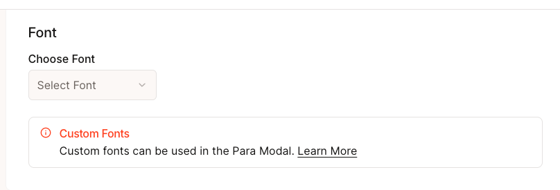
Select fonts that align with your brand identity and ensure readability across email clients.
## Logo Assets
Upload your company's visual assets to personalize email headers and branding.
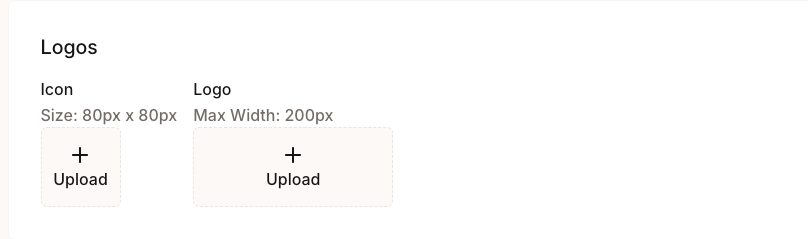
* **Icon**: 80px × 80px square format for email headers
* **Logo**: Maximum width 200px for email signatures and footers
* **Format**: PNG or SVG recommended for best quality
* **Background**: Transparent backgrounds work best
## Social Links
Add your company's social media and website links to email footers. These links will appear in all automated emails, providing users with easy access to your online presence.
### Available Links
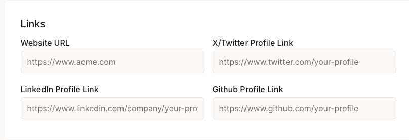
* **Website URL**: Your company's main website
* **X/Twitter Profile**: Twitter or X profile link
* **LinkedIn Profile**: Company or founder LinkedIn page
* **GitHub Profile**: Company or project GitHub repository
## Email Impact
These branding settings specifically affect:
### Welcome Emails
* Sent to new users during initial registration
* Display your logo, brand colors, and company links
* Include verification links with your custom styling
### OTP Emails
* Sent during two-factor authentication
* Use your brand colors and typography
* Include your logo for brand recognition
Email branding settings do NOT affect your Para modal interface. For modal customization, see the .
## Next Steps

 ### Color Settings
* **Foreground**: Primary brand color for buttons, links, and highlights
* **Background**: Background color for email content areas
* **Accent (Optional)**: Secondary color for borders and accents
### Color Settings
* **Foreground**: Primary brand color for buttons, links, and highlights
* **Background**: Background color for email content areas
* **Accent (Optional)**: Secondary color for borders and accents
 ## Logo Assets
Upload your company's visual assets to personalize email headers and branding.
## Logo Assets
Upload your company's visual assets to personalize email headers and branding.
 ### Available Links
* **Website URL**: Your company's main website
* **X/Twitter Profile**: Twitter or X profile link
* **LinkedIn Profile**: Company or founder LinkedIn page
* **GitHub Profile**: Company or project GitHub repository
## Email Impact
These branding settings specifically affect:
### Welcome Emails
* Sent to new users during initial registration
* Display your logo, brand colors, and company links
* Include verification links with your custom styling
### OTP Emails
* Sent during two-factor authentication
* Use your brand colors and typography
* Include your logo for brand recognition
### Available Links
* **Website URL**: Your company's main website
* **X/Twitter Profile**: Twitter or X profile link
* **LinkedIn Profile**: Company or founder LinkedIn page
* **GitHub Profile**: Company or project GitHub repository
## Email Impact
These branding settings specifically affect:
### Welcome Emails
* Sent to new users during initial registration
* Display your logo, brand colors, and company links
* Include verification links with your custom styling
### OTP Emails
* Sent during two-factor authentication
* Use your brand colors and typography
* Include your logo for brand recognition